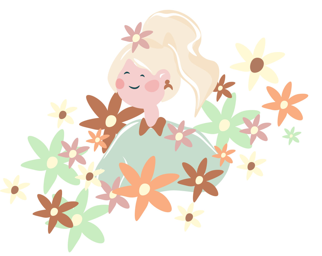
User experience in Animal Crossing
Chances are you might have heard of this game called Animal Crossing. Nintendo’s latest version New Horizons has taken the gaming world by storm and here’s a few reasons why.
It’s time to escape, break away and finally fly the nest. Mom’s sad but she’ll slowly get over it by sending you passive aggressive snail mail gifts of cake, cushions and knapsacks.
The game starts as you prepare to fly to your very own deserted island with a couple of cute racoons, Tommy & Timmy. Once there you’re introduced to Tom Nook, the ty-racoon responsible for bringing you to the island and guiding you on your path to self independence - all for just a few bells.
The game play is centered around cultivating your dream home/island and gives you the opportunity to do things at your own pace, gathering new villagers as you go to inhabit your island. There is no end goal to the game which is part of what makes Animal Crossing such a deeply engaging experience for many users. It’s non committal approach builds a bond with users forged not from obligation or completion but from a sheer devotion to the game.
After over 150 hours of gameplay in the last couple of months (it has been lockdown), here are a few lessons I’ve learnt and a few examples of how Nintendo has created a unique user experience, which we as UX designers can implement into our own daily work.
Radiate Positivity.
Never underestimate the power of positivity, creating a positive environment for your user really is a no brainer, nobody wants to be left feeling bad about a situation or interaction whether that be real life or digitally.
The messaging within Animal Crossing always denotes a positive tone, even when they expect the player might not be too happy about a situation, like catching a Sea Bass for the 100th time. These little positive messages help empower the player and encourage them to simply try again.
Messages of encouragement or even acknowledgment are definitely things to consider when developing your product or service. We’ve all experienced that frustrating feeling when we go to place something in our cart and it’s sold out or even worse when we’ve purchased it! Wouldn’t it be helpful if someone acknowledged our situation or told us when it would be back in stock? Always be sure to include acknowledgement messaging so you’re not frustrating your audience.
Don’t make users feel bad for their decisions.
Blathers is the resident museum curator on your island, he’s passionate about his work and he’s a talker - I’m pretty sure we all know a Blathers. When you donate a fossil, fish, bug or art piece to the museum he always gives you the option to hear more.
Often I don’t really want to hear about every item I donate to the museum, a girls gotta island to build here. But I also don’t want a negative response or confrontation or to simply just feel bad for not wanting the extended conversation. Once you press the ‘I’m fine for now’ option Blathers simply responds positively, usually with something along the lines of ‘Ah, I see another time perhaps’.
This is a key lesson we can learn when developing UX experiences within our own sites/products. You never want the user to feel bad or guilty when making a decision. You should always empower your users and leave them feeling confident to explore your product with no worry of seeing negative messaging or having a negative experience because they didn’t fulfill your personal objective. Remember to always keep messaging light and don’t force anything on your audience and customer, doing so might push them away from your product or service.
Be their cheerleader - build the users confidence.
Who doesn’t like to feel appreciated and special? Animal Crossing has a knack of making the user feel appreciated in a couple of pretty genius ways.
One of which is by receiving postcards from other villagers on your island. Often villagers will send you thoughtful messages and gifts just to show you how much you mean to them - some will even go a step further by attaching gifts, ain’t that sweet?
This is a pretty nifty idea by Nintendo which creates a bond between the user and the villagers and builds trust and a deeper emotional connection to the product through shared experience.
Birthdays are yet another great way Animal Crossing helps to showcase their appreciation. I mean it doesn’t get much better than a day devoted to you and a giant birthday cake right? We can easily implement this strategy into our own products by using messaging which champions the user and acknowledges their actions and achievements.
A great example of this is when Mailchimp gives you a virtual high five when you schedule/send out an email marketing campaign. Why not let the user know how much you appreciate their actions, for example when a customer purchases something wouldn’t it be great to acknowledge that with a thank you or simple animation of a smiling face?
Give users the ability to skip unwanted content.
To tackle some of the more lengthy repetitive content which is featured in Animal Crossing they allow the user to speed up the content, although they don’t allow you to skip the content completely, this fast forward effect gives the player a sense of control and gives the user the ability to ‘skip’ unnecessary or unwanted content.
Time is precious and features like this allow the user to get to the good stuff more easily. Allowing users to skip walls of text and mammoth amounts of information quickly, is really important. Especially when it’s likely the user has already read the information previously, including CTA’s like ‘Don’t show this again’ is really helpful to keep content streamlined and to avoid any user frustrations.
Check in with your audience and use confirmations before they make the big decisions.
Before every big decision in the game, like selling items or purchasing art from your cousin Redd you always get a confirmation message before making your final decision. These confirmations are super helpful so that you don’t sell something you mean to keep or buy something which you didn’t actually want.
Confirming with the user is really important and avoids unnecessary errors and pain points. There are times when the user might be in a hurry or or not concentrating fully on what they’re clicking on so it’s always a good idea to check in with users before any big decisions are made.
Ask yourself, is there going to be a dire consequence to my users? Will that action have a knock on effect if they click something by mistake?
If the answer is yes then it’s always a good indicator that a confirmation message should really be added to avoid any upset. Confirmation messages reassure the user and give them the time to review their options and make sure this is the action they want to take. Confirmation messaging works particularly well when submitting information via a form, it confirms the state of change and allows the user to go back and amend content easily.
Routine and expectancy Contrary to a lot of opinions people actually strive for a routine, whether they admit it or not.
Setting the game in real time puts a slight time pressure on players. With Nooks Cranny opening 8am - 10pm and Daisy May - the snotty nosed pig only selling turnips until noon every Sunday. These real world limitations encourage players to interact with the game along somewhat of a timescale, thus creating a routine. There’s not so much fun to be had when all your villagers are asleep and the shops are shut. Encouraging a sense of routine for their audience is a clever concept, routine usually means expected, calm and regularity. People respond to what they know and leaving breadcrumbs for the player, Nintendo aims to create a sense of familiarity between everyday circumstances and the player.
We can also see this within certain functions in the game such as when we access our savings via the Nook Stop. It pretty much replicates a real world experience of using a cash machine. We can clearly see our savings, our balance and how much we owe Tom Nook for our extortionate mortgage. Giving the user a sense of familiarity is important especially when we think it might be a pain point with our user.
Morning Camper! - gives you insight into the wider world but non committal.
It’s easy to fill your island with cute critters within the first few weeks of playing, but not all villagers get along. Nintendo’s clever introduction of the campsite allows players the opportunity to meet potential new villagers on a non committal basis. Every six days your island will get a visitor to your campsite, here you’re given the opportunity to invite these visitors to come and live on your island permanently, Tom Nook permitting.
This is a really clever way of keeping interests peaked and allowing players to view the wider world outside of their island in a non committal way. It gives the player freedom of choice - but not too much, for it to be overwhelming.
We can liken this to viewing a website’s blog post or a portfolio. It’s really important to give the user the option to explore other related projects or view our interests via a blog, but we don’t want soooo much content that we overwhelm the viewer. Keeping things concise is key to user experience, but we don’t want it to be so familiar that the user gets bored and loses interest. This is a fine line that we as UX designers have to really consider when developing products.
Is Tom Nook really the villain?
We all know Tom Nook, our favourite loanshark rules the roost on this island. But giving you the title of island representative has given you a certain level of status amongst the other villagers - even if you are left paying for all the bridges yourself.
Tom Nook stays as the one in control throughout the game, he is the adult, the one you can go to for support but also gives you the freedom to kind of do what you want and at your own pace. It’s totally fine to blow 260,000 bells on a grand piano, when you have a 2,498,000 mortgage as long as this tycoon doesn’t know - right?
Tom Nook for me is like an FAQ page, if you’re unsure of something you want the opportunity to discover the answer yourself or be able to reach out to someone who can help with your query. You’re never ever going to be able to predict every customer question, but that doesn’t mean you shouldn’t give your audience the opportunity to ask.
Supporting your user should be an end to end process, allowing customers the opportunity to reach out and interact with your product or service with ease. An FAQ page can be a helpful addition to your website giving the user a clear guide to pain points and giving them the opportunity to solve the problem quickly and efficiently. Tom Nook is very subtle in his help, he gives you simple tasks and instructions when you first arrive on the island and guides you through the game by teaching you how to craft, forage and by giving you additional upgrades to make your experience more rewarding on the island.
Although Animal Crossing might seem like an unlikely place to learn more about UX practices, there’s a whole lot of insight we can gain from this game and even implement within our own UX work.
By radiating positivity, empowering our users and championing user achievements through visual confirmations we can create an experience that’s wholesome, rewarding and inviting which will in turn give us a higher chance that users will come back time and again.